
If you’re from the Northeast, in particular, you’re quite possibly familiar with Vermont’s penultimate old-school, traditional glass and pottery maker and purveyor, Simon Pearce. Their trademark celadon crackle glaze was popular seemingly from the first moment of its inception and continues to garner such fervor and admiration even today, whether it’s on bowls, lamps, plates, or pitchers. There are collectors who quite simply cannot get enough of celadon crackle Simon Pearce pottery.
The color itself, however - that somewhat ineffable hybrid of sage, celery, mint, and pistachio - has waxed and waned in its popularity throughout the years in regards to interiors and design, tableware, tile, lighting, fashion, and furniture. Versions of it pop up in Saarinen and Eames furniture, Warhol’s soup can prints, and in Hitchcock’s “The Birds,” an “eau de nil” light green suit is worn by the Tippi Hedren as she flees the maniacal flocks. (You can read a fascinating piece on “eau de nil” and its omnipresence throughout the ages right here.)
Recently, we started a fantastic project in Malibu, a small but incredibly precious jewel of a spot by the sea (#projecttheskyismoreblueinmalibu on Instagram) and immediately noticed our client’s affinity for this sage-y/celadon-ish/eau de nil color - it’s on their living room, kitchen, and dining room walls (the collective space encompasses all three of these rooms, to be fair) and in some of their displayed ceramics, as well. The home is literally atop the Pacific Ocean, so the idea of putting any sort of blue on the walls seems redundant and destined for failure - I mean, how do you compete with the myriad versions of blue offered up by the Pacific Ocean? You don’t.
But we didn’t stay wholly committed to sage/celadon/mint-green, either. Ultimately, we went with our favorite “warm but fresh” white, Benjamin Moore’s Simply White, for the living room, kitchen, and dining room walls, but we wanted to give our fabulously ready-for-change client some sort of sage . . . somewhere. Especially because when you’re in the midst of a complete re-do remodel, you don’t want to ever feel like you’re pushing a client so far out of their comfort zone that they’re a stranger to themselves and the final reveal of the home feels like an unknowable environment they’re forced to reside within. It’s a balance of creating entirely new spaces with new elements, colors, energies, lighting, textiles, art, and furniture, and doing so with the clients’ truest natures being respected, revered, and reflected in the unexpected and wonderful newness.
And so, here we are, right now, with a Malibu bathroom fated-to-be-painted in Farrow and Ball’s Green Blue and we’re currently cooking up some ways we can bring some sage-y celadon into their kitchen cabinetry. We’re currently keeping it in our back pocket - because a bit of this pale green goes a long, long way, baby, whether it veers towards celery, serpentine, jade, or minty fresh.
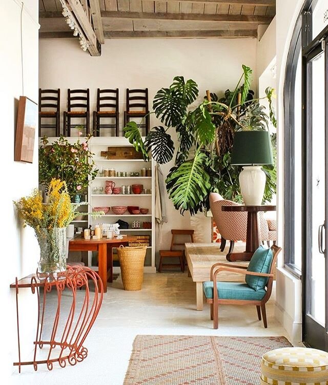
Since we took a dive into the world of sage and found some amazing things while doing so (like incredible cement sinks , The Road to Todos Santos paint, and deliriously delicious settees, for example), we’re sharing some of this sage-y beauty with you! All for the love of sage. Enjoy!

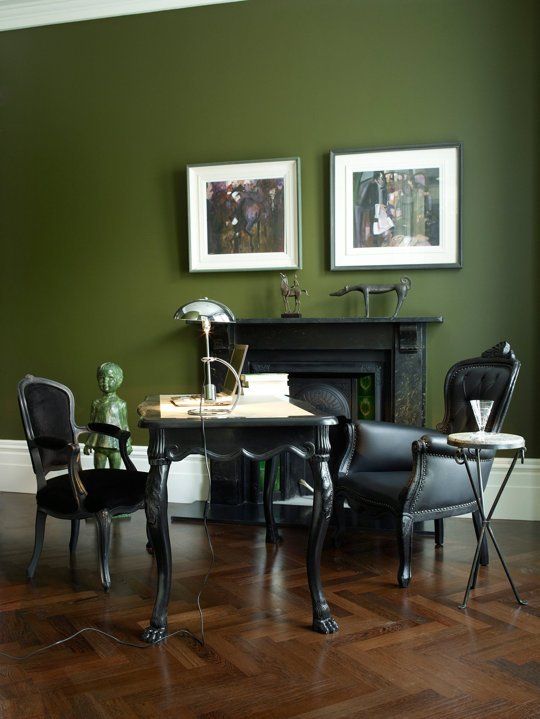
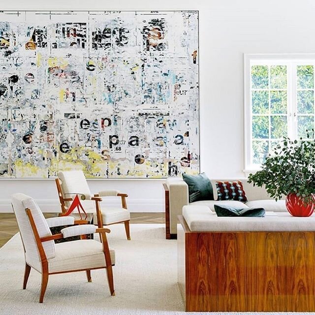
Studio Ashby, London penthouse.

Jimi Sofa, made in Spain; 1stdibs
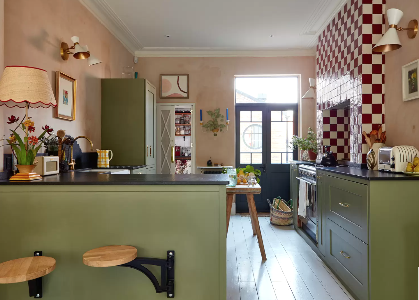
Designer Matilda Goad’s U.K. home

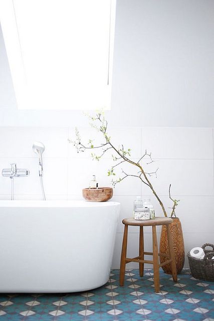
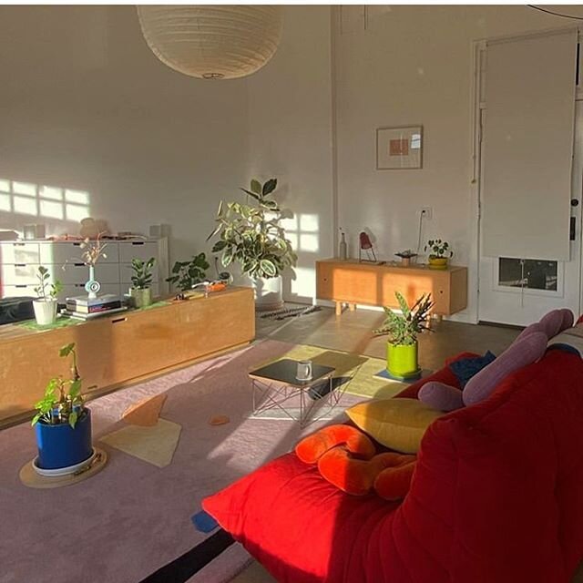
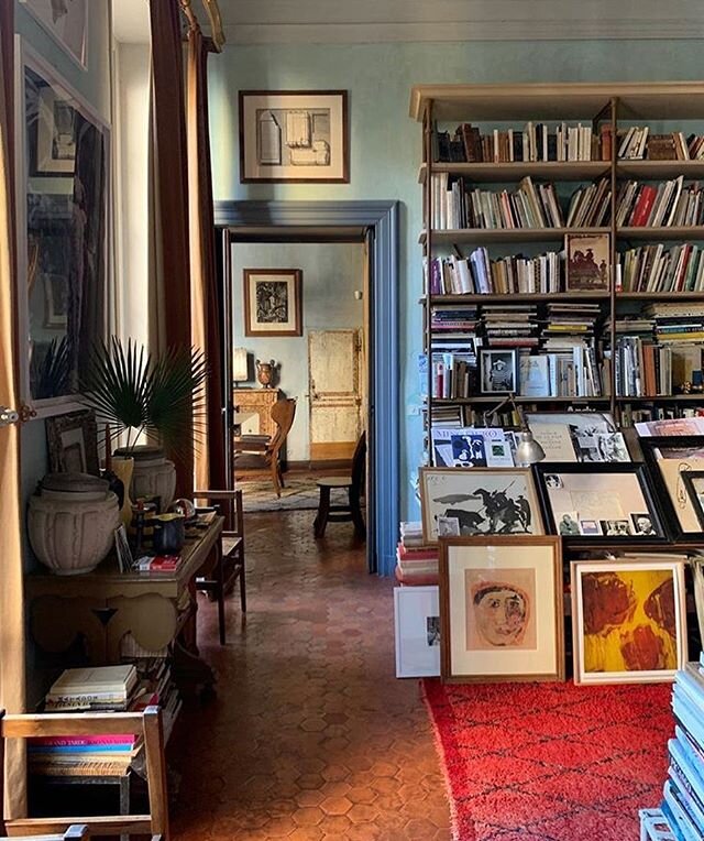
Carolina Mariana Rodriguez, Apartment Therapy

Thonet Targa 2-seat sofa by GamFraseti

ASKA’s Maria NIla Salon

Leo Bruno Todd painting

Concretti Designs concrete sink (in Pistachio)
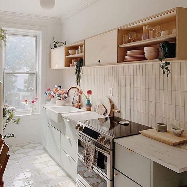
Sandra Relagado’s Barcelona home, Apartment Therapy

Architects EAT, Melbourne, Australia