If you’ve ever painted your home, you understand the anguish of getting the color just right. Only the most valiant of us go full steam ahead and buy several gallons of Petal Dust and slather the walls with it only to find you’ve turned your guest bathroom into a strange and fairly creepy accidental nursery. The most pragmatic of us buy color samples first (Benjamin Moore makes this ridiculously easy) and check out large swathes of hues before committing to several gallons’ worth. This is, by the way, because paint chips lie. They may not mean to, but they do.
Alternatively, you can upload a photo onto Sherwin Williams or Valspar Paint to see how the possible colors will look in your actual space. But I’ve often found there’s nothing like wholly experiencing the colors in the room itself – watching how the light changes throughout the day and how it affects the depth and profundity of the palette.
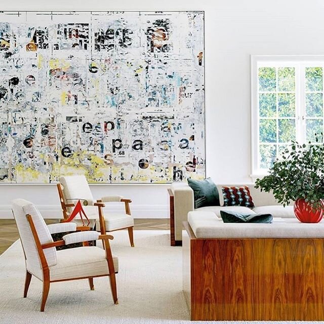
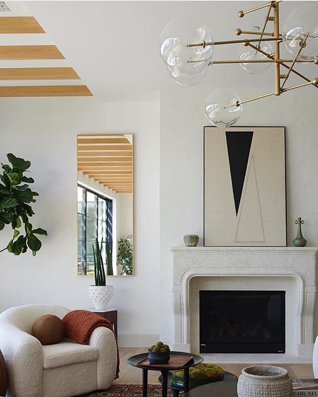
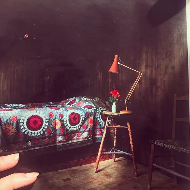
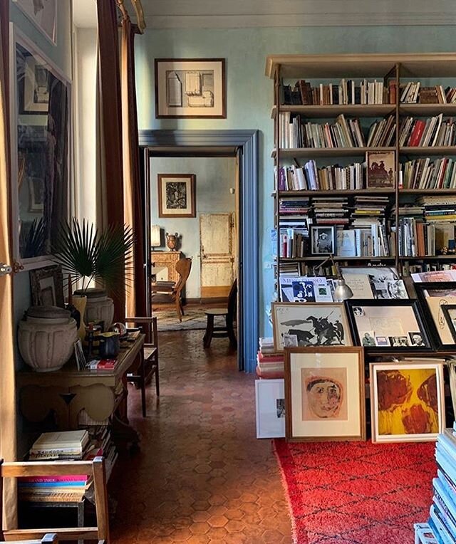
Rue Magazine recently published “13 Rooms That Prove Black is Back,” showing this “colorless” color in bedrooms, living rooms, bathrooms, and hallways. While black never really left, particularly in clothing, it does seem that deep, intense colors like dark charcoal or ebony can actually work magic in grounding a space, especially one with loads of natural light.
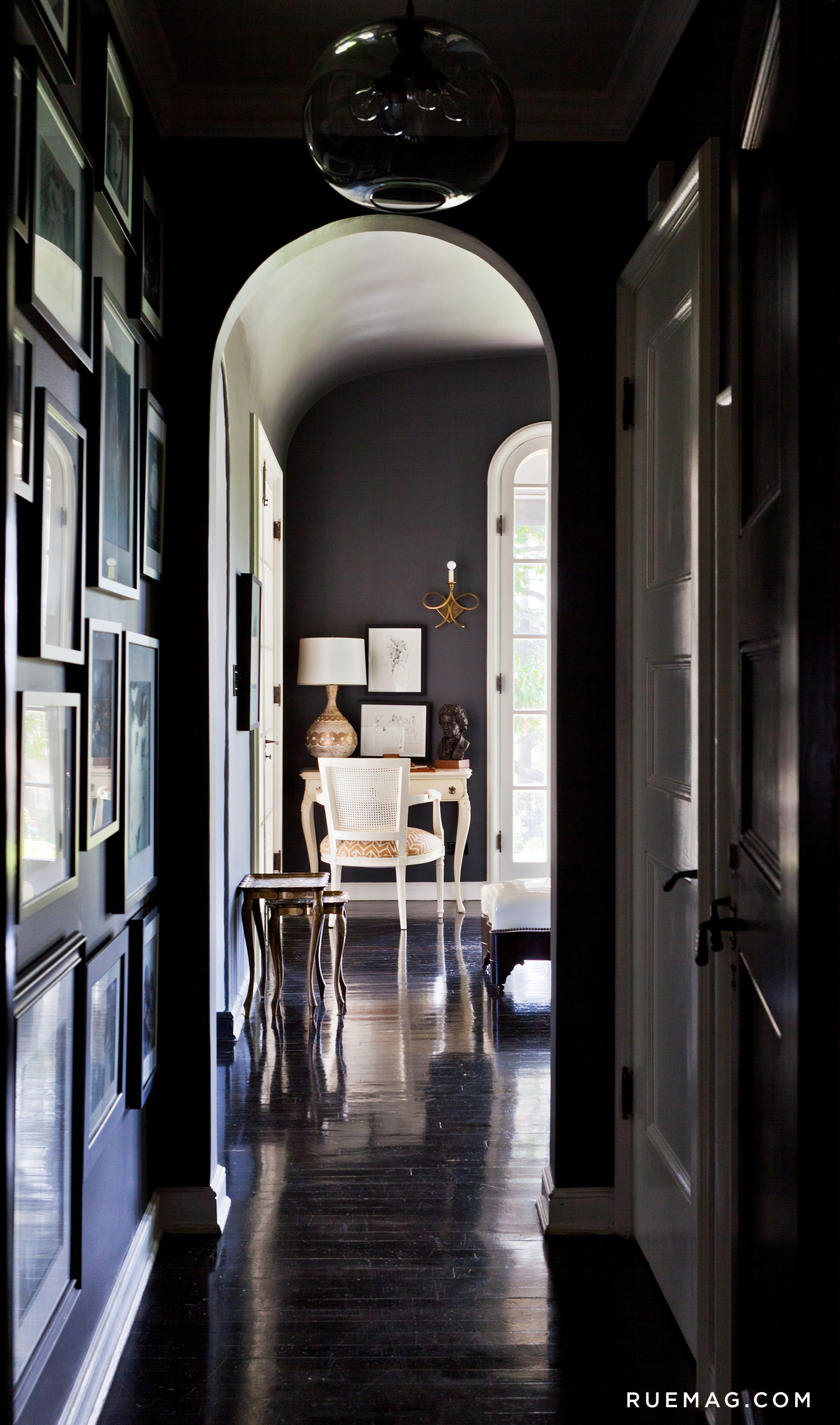
(image source: Rue Magazine)
Ruminating on my ever-enduring love of black (dresses, shoes, bags, et al), I began to think about the emotional meaning of colors. According to color consultants, the shades with which we decorate have the power to affect our moods and behavior. Even Picasso said that "colors, like features, follow the changes of emotion." While I personally LOVE white walls for uncomplicated art hanging (and trust me when I say there are literally thousands of versions of white paint in the world) I'm not opposed to using color in our clients' homes! That said, here are some fun Lily Spindle ideas, room by room, to maximize the potential of your space when picking out your paint colors.
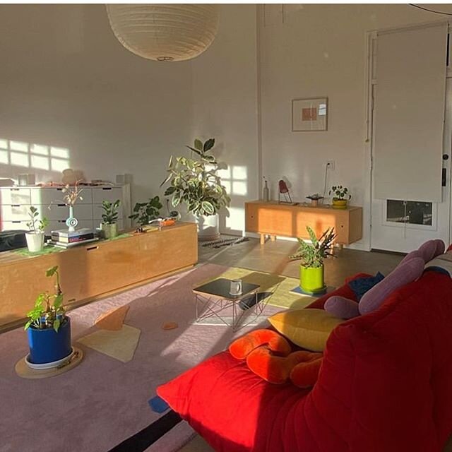
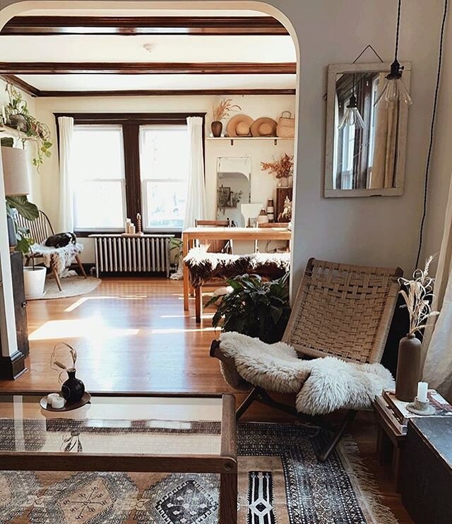
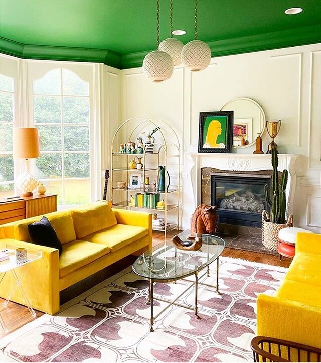
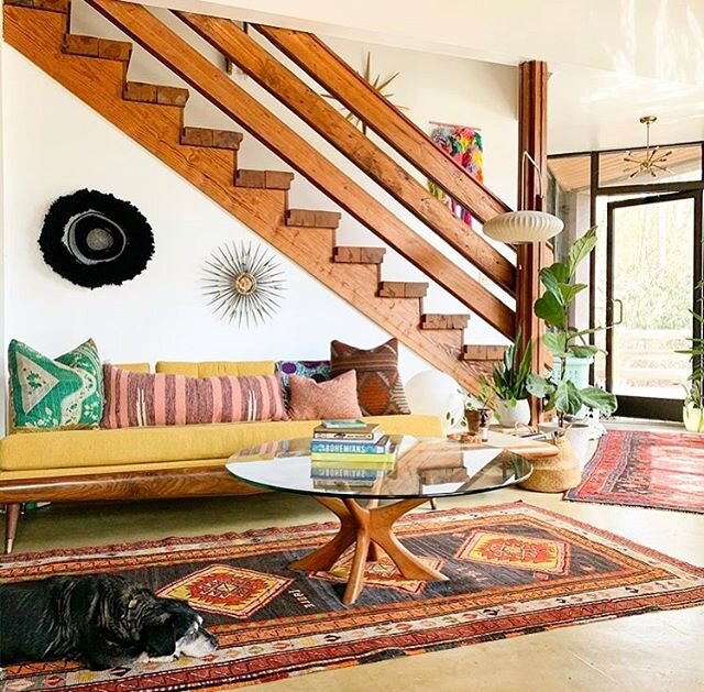
LIVING ROOM - Warm, autumnal tones like brown, orange, red, yellow, and beige are fitting for your living room as they can encourage conversation, comfort, and connectivity. The warmth of the wall colors lends itself to the warmth of the room’s occupants, enhancing a natural camaraderie and rapport.
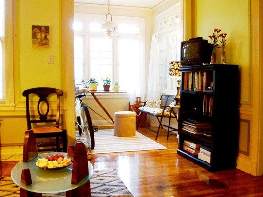

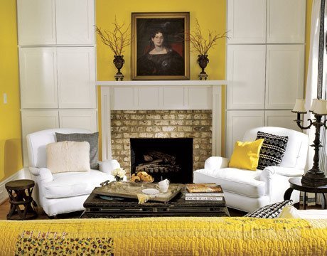
(image source: Desire to Inspire, Apartment Therapy, Interiorholic)
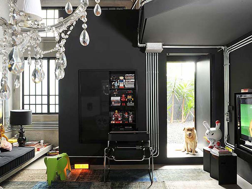
Home office: The best color for your home office may be contingent upon what kind of work you’re engaged in. Renowned color psychologist Angela Wright breaks it down like this – blue stimulates your mind and inspires productivity (suitable for say, an accountant); yellow stimulates your ego and optimism and bolsters creativity (suitable for say, a graphic designer); green provides balance and reassurance and is thusly ideal for conducting financial transactions.
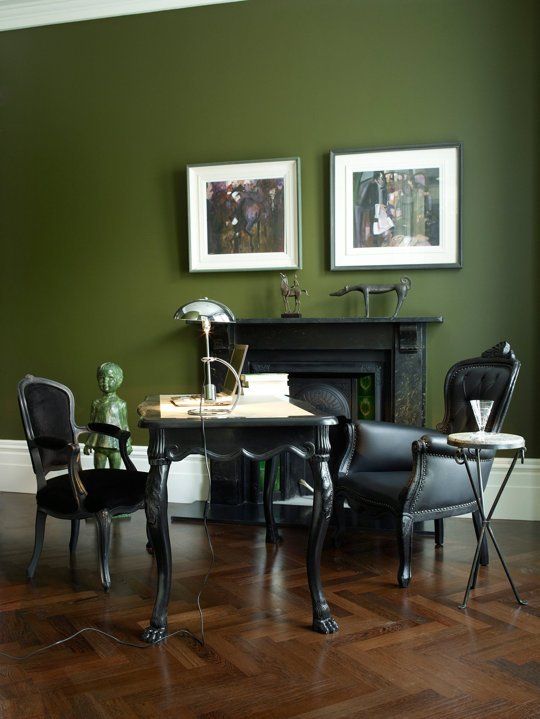
(image source: Pinterest)
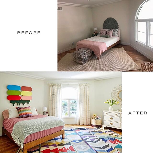
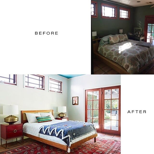
BEDROOM : Unless you’re into a quickened heart rate and increase in stress whilst trying to get some shut-eye or romantically woo your partner, skip the red walls in the boudoir. Instead, go for blue or green or gauzy, dreamy versions of grey and white – all colors that typically invite calm and peace.
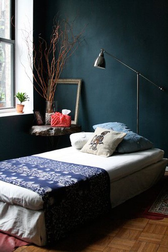
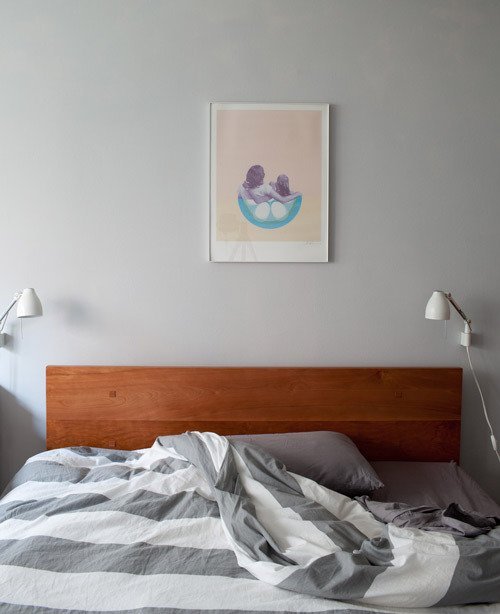
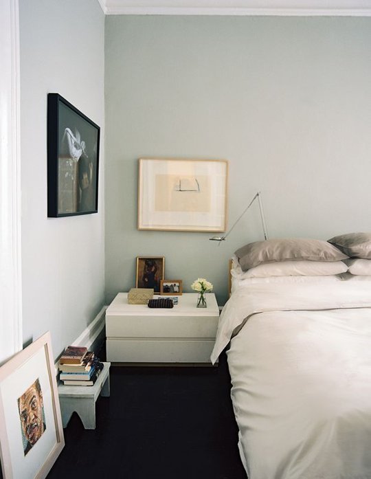
(image source: Apartment Therapy, Design Sponge, Lonny)
DINING ROOM : If you’re a serious lover of scarlet, your place to do it is in the dining room. Red increases your appetite and stimulates activity, perhaps promising a more interesting dinner party than you might have anticipated, which is never a bad thing in my book.

(image source: HGTV)
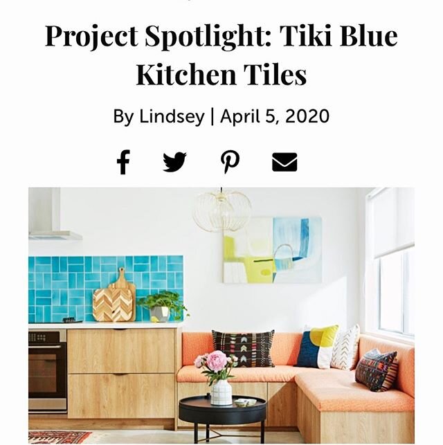
BATHROOM : What we consider to be fresh and clean colors like white, ivory, taupe, as well as hues evocative of the sea – turquoise, blues, and greens – are infallible in the bathroom. Using tile to add some texture, pattern, and pops of color is pretty ingenious and can be surprisingly sexy.

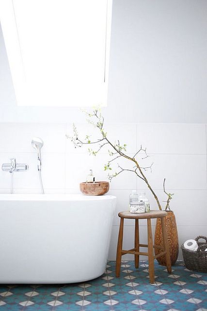
(image source: www.lovelylife.se/; Apartment Therapy) Source: The Influence of Color on Physiological Response.