lily spindle tips

12 Black + White Pendants to Knock Your Socks Off

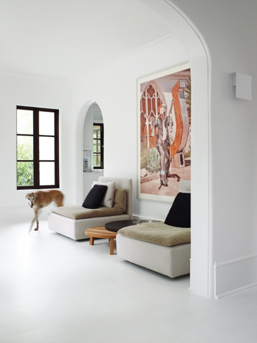
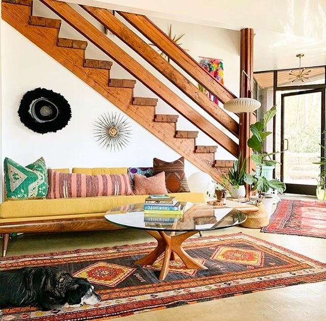
Ah . . . the almighty pendant. Strong on its own, marvelous in a group, it plays well with others, serving its own purpose and distinction in a space already offering recessed or spot-lit sconce lighting. A single pendant in a bathroom can be surprisingly stunning, a series of pendants down a hallway is a solid middle finger to the tradition of modest, subtle flush-mount lighting, announcing “more is more, babe. live with it.” And because we’ve had a few clients over the years wonder about the vernacular of “pendant” versus ”chandelier,” here are the general contrasts between the two: while a pendant is a singular fixture hanging from a rod, cord, or chain, chandeliers are oftentimes hanging by a chain with a central body and varying branches extended from the main body; pendants can provide wonderful task lighting while chandeliers impart a more romantic glow (otherwise known as “mood lighting” rendering everyone’s skin flawless); there’s also a fairly strong price disparity between pendants and chandeliers, with pendants typically being less costly versus the larger dimensions, more expensive materials, and the cost of professional installation a big-ass, ornate chandelier can require.

Here’s a handful of pendant “rules” to play by:

1) In an entryway, a pendant should be hung approximately 7’ from the floor. (We’re not big fans of the word “should” in most contexts, but when you don’t want people walking into the bottom of a pendant light upon entering your home, I think “should” is appropriately used in guiding decision-making). Of course, if you’ve got a 30’ ceiling in your two-story foyer, the suggested 7’ guideline wouldn’t apply - in the grandiose, sweeping foyer scenario, we recommend splitting the vertical space into thirds and hanging the pendant 2/3 from the ground floor.

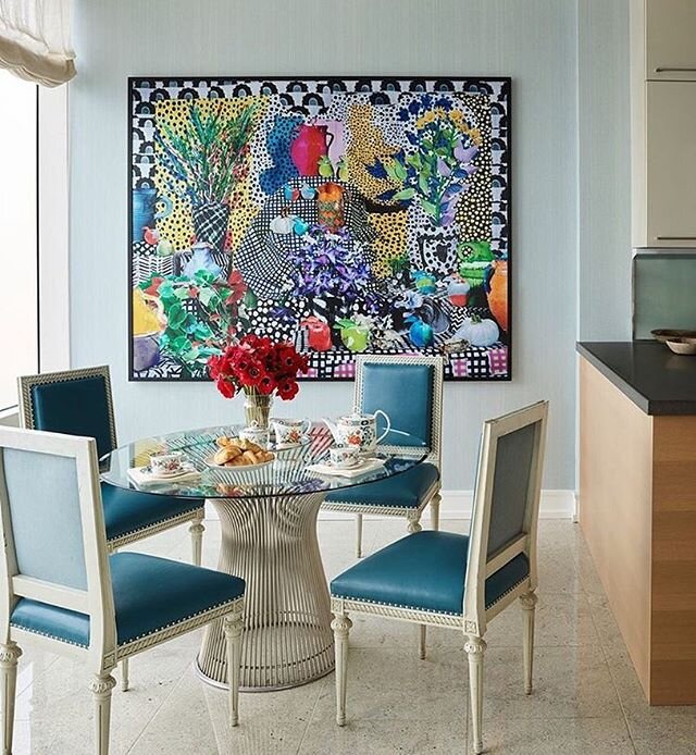
2) Over a dining table, the standard drop is anywhere from 28” - 36” between the bottom of the pendant and the dining table itself. Most common and a fairly safe guideline is to go with 30 inches. But if your ceilings are taller than 8 feet, you can easily keep 36” - 40” of space between the dining table and pendant and no one will rudely comment or quietly think you’re a weirdo.

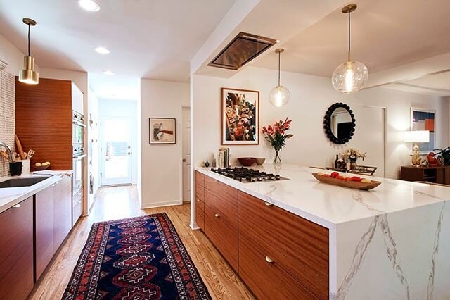
3) Hanging multiple pendants over a kitchen island or dining table is a fabulous way to bring needed light into your space while also making a conscious design statement by way of the scale, shape, color, material, and style. Typically, they ought to be hung 24” - 30” apart from one another, so use that as a guideline to determine the number of pendants you’ll be hanging! ****For example, if your kitchen island is five feet long, two medium pendants (approximately 12”-16” diameter or thereabouts) should suffice. Find the island’s center point of 36” and hang the two beauts equidistant from one another (so let’s just say 15”- 18” each off the center point, depending upon if you want 30 or 36 inches of space between the pendants). Yes, it’s a bit of math, but mostly it’s math plus instinct (which I realize is more math) - the pendants need to relate to one another while not leaving too much unlit island on either side and not seeming mashed together like a codependent couple. Got it?

4) ALWAYS have dimmers connected to your pendants (and any hard-wired lighting in your kitchen, den, living room, TV room, library, or lounge, for that matter). It’s beyond worth the necessary additional costs during installation. Even if you want to save those extra bucks and you’re nearing your budget’s high-end or are over budget and having a meltdown, HAVE THOSE DIMMERS INSTALLED IN YOUR HOME’S COMMON AREAS. Not only will their addition monumentally improve the quality of your own life residing there, but dimmers increase the heck out of your home’s value, so it positively impacts your potential resale down the line. (You can thank us later.)

For awhile, it seemed like everyone and their second cousin twice removed had this IKEA pendant and I wouldn’t blame IKEA for never ever discontinuing the design because it’s GOOD (and less than $70, for heaven’s sake). We saw this dang pendant EVERYWHERE in Los Angeles and its common placement in restaurants, for example, belied its insanely low price point. The range of pendant designs is incredibly broad, from mid-century modern to bohemian to traditional, and the pricing is equally all over the place. The excellent news is this - you can get a DAMN FINE, sizable, beautiful pendant for less than $500 (and you don’t have to join the IKEA legions to do so).

More than half of the black and white pendants we’ve pulled together here fit that under-$500 niche - one is inspired by Japanese teapots, another inspired by an overturned water vessel, another made from two delicate tiers of bent bamboo slats (!!). In the realm of pendants, there’s certainly no shortage of Tom Dixon knock-offs, but we’re pretty much purists when it comes to George Nelson, and the older the better! For the purposes of this post, we’ve specifically opted for black and white pendants, but I’m 100% confident we can devote a future post to our favorite rattan, glass, and brass pendants, so stay tuned for a future pendant-love post!

127263.jpg
127684.jpg

Our top 12 outdoor furniture picks (plus an honorable mention)

It may be overcast and chilly by Los Angeles’ standards right now, but trust us - summer is a-comin! And that means a few things are top priority — it’s time to invest in another wide-brimmed hat for beach days, errand-running mornings, and flea and farmers’ marketing on the weekends; get yourself a damn good face sunscreen because melanoma is real, y’all (I happen to love this one, actually), and, yes, that back patio / back yard / deck / poolside situation you’ve got going on could desperately use some thoughtful love and attention.

While it’s true that us Californians can take advantage of the outdoors more often than other parts of the country and are therefore pretty intense when it comes to our outdoor spaces being lovely and livable, it can easily be argued that areas where the sunny, warm season is an ephemeral three to four months ought to take their outdoor areas even more seriously because that quarterly seasonal stretch is over before you can say “vegan hot dogs and buns on the barbecue.” Also, getting outside is good for your health, so we all should be doing it.

We’ve often had clients ask us about outdoor furniture because it seems there’s a bit of a dearth in the market for attractive outdoor pieces substantial enough to endure the elements of relentless sunlight (hi, desert), occasional precipitation (hi, desert), and regular wear and tear. When I was working with a designer in Santa Monica, whenever we’d sell vintage outdoor pieces to a client, we’d consistently recommend, with very few exceptions, that most of our vintage outdoor pieces be placed under covered patio and backyard spaces for protection from the weather. Really, I suppose once it’s yours, you can do whatever the heck you like with it, but if you want a vintage rattan Peacock chair (and we mean actual rattan, not newly-made faux rattan made from polyethylene created to tolerate extreme heat and cold) to last more than a year, you put that precious shit under a canopy, my friend.

Some tips from us Lily Spindle ladies:

  1. Consult with (and potentially hire) a good, trustworthy landscape designer when it comes to the design and creation of your pathways and walkways, gardens, plantings, lighting, and irrigation systems. There’s an artistry to landscape design just as there is to interior design and the knowledge and guidance landscape designers can impart is inimitable. (When it comes to the furniture bits, however we’re the women to call because just as architects are brilliant at what they do, it’s likely you don’t want them choosing your sofa, dining chairs, or bathroom finishes, for that matter)

  2. If you don’t dine al fresco on your own but do have lots of guests with kids and the like during the warmer months, choose a dining table large enough to accommodate at least 8-10 people. Benches (whether built-in or otherwise) are fantastic for this purpose because they provide ample seating for a fair amount of large and small humans and can be utilized differently when not in use at the dining table.

  3. Consider where you’re setting up your potential lounge area. Is there blazing sun all afternoon long? It may not seem like a problem initially, but no sane adult person will want to hang out there without coverage of some kind - a well-placed umbrella or two, a beautiful pergola, or a simple sail shade fabric cover will make the space decidedly more alluring. Additionally, a gorgeous pergola is romantic, practical, and adds value to your home, to boot.

  4. Buy native plants. We live in an urban desert, for instance, and maintaining the health and vitality of a lawn is a fruitless and gross water-wasting obsession. Research the best plants for your region and refer to tip #1 for further details and wisdom!

  5. Your outdoor furniture should reflect the design and feel of your home’s architecture and interior, as well. I guess it goes without saying, but we’ll say it nonetheless . . . if your home is super modern and clean, a set of ornate, tall-backed wicker settees and a silver teak dining table boasting an elaborate base would be a strange departure from your aesthetic and will not look awesome. Not that we have anything against wicker settees and silver teak dining tables! They’re stunning when well-placed and complementing the vibe of the entirety of the space.

  6. If you have a gorgeous view, you are lucky as hell and must take advantage of it.

  7. Don’t knock the string lights. They’re the most functional, least expensive, and easiest means to getting much-needed light in your outdoor living space.

Our top 12 outdoor furniture picks (with an honorable mention tacked on for good measure) features everything from the uber affordable under $200 group to the significantly higher end “pricing upon request” pieces, including sofas, occasional chairs, and tables. Hope it inspires you to get thyself outside and enjoy these wonderful summer days and nights. (And if you’d like our help, don’t hesitate to email us and we’ll happily get you sorted!)

xx - Rebecca + Debra

1 - Malawi Chairs, $399 ; Ixtapa Loveseat, $389 ; Braided Jute Pouf, $90 ; Shroom Coffee Table, $799 - All CB2, as featured in Domino magazine’s tour of Garance Dore’s LA home

SPRING19_jrothenberg_20_1602.jpg
212fa1e1d134aa14c190e163a1f8ed5f.jpg

3 - Isola Teak + Wicker Collection; $399 - $2199

ba0a02e035b3e2fb896c0deecb4cfd49.jpg
f19457560c5c374d1beecb0858a0ca10.jpg
the-everygirl-outdoor-furniture-01.jpg

6 - Paloma Sofa, $788

dd5168e7f872f6dbf9a6fe1abe6f563a-1.jpg
f0697580f84bba7bc59815aa8bd85f84.jpg
116c50382983e046f3125fc2263e23c4.jpg

9 - Fermob Outdoor Furniture Collection
(varying prices and pieces, designed in France)

fermob-sixties-armchair-hero.jpg

10 - Grid Modular Sofa, $9995 - $11,995

grid-modular-outdoor-sofa.jpg

11 - Oasis Sofa + Chaise, $2298 - $3098

oasis_898562_15e.jpg

12 - Tidelli’s Rope Outdoor Furniture Collection
(pricing upon request)

130100.jpg

*Honorable mention* Gajah USA’s Seminyak Rattan Collection; $1495

il_794xN.1909018035_7w7g.jpg

Is your house holiday-ready?

It's barely Halloween and while the Fright Night masks are still on the shelves, retailers are stocking their spaces with holiday baubles, garlands, glass ornaments, and fake wreaths. It may seem crazy to launch the countdown to the holiday festivities so soon, but the celebrating, cooking, and partying of the the last few months of the year begins pretty much NOW and there's nothing like the occasion of entertaining friends and family (and co-workers, in-laws, neighbors, et al) to make you wonder aloud, perhaps gripped with a wave of coinciding panic, "IS MY HOUSE HOLIDAY-READY?"

Never fear, my dears!

Deb and I were talking the other day about how often we operate under tight deadlines with clients for one reason or another - surprise birthday party, cast and crew party, fundraising event, and the list goes on. We LOVE helping people get their homes together to not only feel like a place THEY love to be, but also a place they're proud to share with others. And sometimes all it takes is an outside well-practiced, creative perspective to bring your space to a more gorgeous place -- whether it involves additions or omissions or shifting the awesome things you already own (usually a combination of all three!), we Lily Spindle ladies thrive in the art of reinvigorating everything from a teeny room to an entire home. 

Case in point, for many months our friend Heather had been hunting for a rug to bring together her living room. So after a few conversations with her, Deb and I immediately hopped to it and scored her an awesome deep pink and apricot striped Turkish 5' x 8' rug (having told her we thought that Amalfi/Venetian pink was the right vibe).  The rug arrived within five days, she got herself the rug pad, and Heather was entirely stoked with the result. This is what she had to say about our work: "You two birds helped me conquer my carpet block within 24 hours! Your expert eyes quickly honed in on just the right textures and colors and I love my joyous living room even more now." Check it out below...

Heather's Noguchi coffee table and Eames molded plywood chairs are now fabulously moored by the colorful Turkish rug we discovered..

Heather's Noguchi coffee table and Eames molded plywood chairs are now fabulously moored by the colorful Turkish rug we discovered..


This Franklin Hills patio with an incredible view was staged and ready to roll for our client's cast and crew party and, come evening, the summer air and flickering candlelight completed the cozy scene. 

This Franklin Hills patio with an incredible view was staged and ready to roll for our client's cast and crew party and, come evening, the summer air and flickering candlelight completed the cozy scene. 


We also just wrapped up a project that took three and a half weeks from start to finish. Lily Spindle outfitted our client for an entirely new space, starting 100% from scratch and sourcing every single thing for his pied a terre from doormats to dining chairs and pretty much every conceivable thing in between! *Not-so-great iPhone snaps shown below! 


And so, DON'T FRET ABOUT THE IMMINENT HOLIDAY PARTIES + DINNERS, ok? Lily Spindle is at your service with our years of design experience. 

Need a new sofa?
Done.

Need an oversized vintage mirror in the alcove?
Copy that.

In need of an original painting?
Check.

Not even quite sure what it is that you need?
No worries! We'll sort it for you/with you/on your behalf. 

xx ~ Rebecca + Deb 

The Best White Paints in the Business

Deb and I have known each other for a long time and as a natural consequence of spending many hours together, jokes have developed and insinuated themselves into our lexicon as friends and business partners. For example, I have an abiding need to throw my body into every Chesterfield sofa I encounter and every few hours, without fail, I can be relied upon to announce, "I'm hungry," and we've got to remedy that real quick or I become almost inconsolable. Also, sometimes, we show up for an art opening or similar event wearing basically the same outfit.

Recently, we were on a job site in Silver Lake and I was trying to convince a client obsessed with green paint for his home (which was already a flat, rather dark sage green and had been for nearly a decade) that a version of white was an absolutely infallible option. I actually uttered the words "a yummy white" in the midst of my persuasive speech and in my peripheral vision, felt Deb throw me a look like, "what the hell are you talking about?" Because, 9 times out of 10, as Deb is fully aware, I'm pushing for a white wall. But now I'm using the word "yummy" to make it more tantalizing. A groan and eye roll is totally justified. 

Yes, I love a white wall. I really, really do. I adore an accent wall in a bright, bold, surprising color. I admire dark, deep colors in small spaces. And I understand and honor the theory of paint color affecting your mood. But I really love white. Maybe it's because of all the art I think looks incredible against white, but it's my go-to paint color, no matter the space. My argument is that no white is exactly the same, as white, in the visual spectrum, actually reflects light and is a presence of all colors (it's science).

                      Some of our favorite whites pulled together as evidence - no white is exactly like any other. 

                      Some of our favorite whites pulled together as evidence - no white is exactly like any other. 

Here are five CANNOT GO WRONG WHITES::

DECORATOR'S WHITE, CC-20 (BENJAMIN MOORE) ::

A clean, soft white that isn't too cool and isn't too warm, but always feels fresh and brings radiance to a room. 

Designer Barbara Hill used flat Benjamin Moore’s Decorators White throughout this 1920s abode in Atlanta, Georgia. DWELL magazine; photo by Gregory Miller.

Designer Barbara Hill used flat Benjamin Moore’s Decorators White throughout this 1920s abode in Atlanta, Georgia. DWELL magazine; photo by Gregory Miller.

GREAT WHITE (FARROW AND BALL) ::

One of those mercurial whites, becoming pale yellow or pink or even lilac in hue, depending upon the time of day, the slant of light, or the furnishings in the space. 

              Farrow + Ball's "Great White" (from F+B site)

              Farrow + Ball's "Great White" (from F+B site)

SWISS COFFEE (BENJAMIN MOORE) ::

This white is warm and creamy, elegant and peaceful. It's just plain ol' excellent. And not just because Veronica Mars digs it. 

Kristin Bell, her dogs, and Benjamin Moore's "Swiss Coffee" on the walls, "Simply White" on the cabinets. 

Kristin Bell, her dogs, and Benjamin Moore's "Swiss Coffee" on the walls, "Simply White" on the cabinets. 

MASCARPONE (BENJAMIN MOORE) ::

True to its delicious namesake (you see why I started calling white paint colors "yummy"?), this is a velvety, smooth, ever-so-slightly golden white. We've used it in bedrooms, living rooms, dining rooms, and bathrooms and it's equally awesome in each. 

BM Mascarpone offset by a pop of orange in the home of a digital designer, using the high chroma colors of BM's 2016 Trends Palette .Image source: Copperline

BM Mascarpone offset by a pop of orange in the home of a digital designer, using the high chroma colors of BM's 2016 Trends Palette .Image source: Copperline


PURE WHITE (SHERWIN WILLIAMS) ::

Bright and crisp, timeless white. Let's put it this way: it's part of the Pottery Barn 2016 Spring/Summer color collection. It works just as well on furniture as it does on walls and cabinets. 

Pure White cabinets make for a happy and cheerful kitchen no?Image source: Decorpad

Pure White cabinets make for a happy and cheerful kitchen no?
Image source: Decorpad


Now, I KNOW you want to know if my "yummy white" speech was convincing for the aforementioned client slightly obsessed with sage green. Stay tuned. We'll share that news in future posts! 

xx - Rebecca