deb vigna

It's that time of year again, y'all. It's Punchlines for Paws!

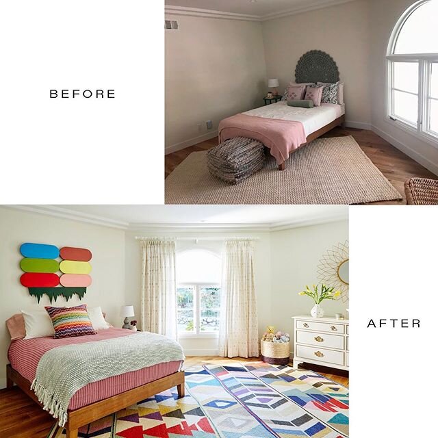
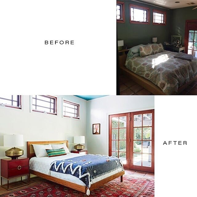
Here's some mid-March musings for you lovely creatures! 

First of all, we're pumped the sun has come out again here in Los Angeles and, secondly, we are SUPER PUMPED for Punchlines for Paws next month! Who can resist gut-splitting laughs and adorable rescue dogs? Pretty much NO ONE. Whitney Cummings and Andy Richter will be gracing the stage, among many other funny, animal-loving folks (famous and otherwise). Crazy good silent auction items, to boot. We're talking crazy good - art, trips, jewelry, clothing, services...it's all excellent. Pssst....we'll be donating a free 2-hour in-home design consultation with, you know, US, so there's at least one thing you know you wanna bid on! All ticket and silent auction proceeds go to Home Dog LA and A Purposeful Rescue, as these two amazing (and entirely female-run) organizations have joined forces for this particular event. Buy your tickets ASAP! 

92c1dc61-52d9-4ba4-8f3b-3e2e5fa4c348.jpg

What's the psychology and pragmatism and creative discussion that results in color creation of the Pantone sort? This fascinating read on color forecasting in NY Times Magazine blew our minds. How did Pantone create 1999's Cerulean Blue? What particular pink was 2014's color of the year (you product junkies will know this, no doubt)? In what ways does color subtly communicate? Yep. Minds officially BLOWN!

Get yourself to The Broad . . . "One hopes for something resembling truth, some sense of life, even of grace, to flicker, at least, in the work." Jasper John's epic exhibition at The Broad, featuring more than 120 paintings, drawings, sculptures, and prints, is on view until May 13th. It's been described as blissful. We can all use a bit of bliss, no? Get your tickets here.
 

The Best White Paints in the Business

Deb and I have known each other for a long time and as a natural consequence of spending many hours together, jokes have developed and insinuated themselves into our lexicon as friends and business partners. For example, I have an abiding need to throw my body into every Chesterfield sofa I encounter and every few hours, without fail, I can be relied upon to announce, "I'm hungry," and we've got to remedy that real quick or I become almost inconsolable. Also, sometimes, we show up for an art opening or similar event wearing basically the same outfit.

Recently, we were on a job site in Silver Lake and I was trying to convince a client obsessed with green paint for his home (which was already a flat, rather dark sage green and had been for nearly a decade) that a version of white was an absolutely infallible option. I actually uttered the words "a yummy white" in the midst of my persuasive speech and in my peripheral vision, felt Deb throw me a look like, "what the hell are you talking about?" Because, 9 times out of 10, as Deb is fully aware, I'm pushing for a white wall. But now I'm using the word "yummy" to make it more tantalizing. A groan and eye roll is totally justified. 

Yes, I love a white wall. I really, really do. I adore an accent wall in a bright, bold, surprising color. I admire dark, deep colors in small spaces. And I understand and honor the theory of paint color affecting your mood. But I really love white. Maybe it's because of all the art I think looks incredible against white, but it's my go-to paint color, no matter the space. My argument is that no white is exactly the same, as white, in the visual spectrum, actually reflects light and is a presence of all colors (it's science).

                      Some of our favorite whites pulled together as evidence - no white is exactly like any other. 

                      Some of our favorite whites pulled together as evidence - no white is exactly like any other. 

Here are five CANNOT GO WRONG WHITES::

DECORATOR'S WHITE, CC-20 (BENJAMIN MOORE) ::

A clean, soft white that isn't too cool and isn't too warm, but always feels fresh and brings radiance to a room. 

Designer Barbara Hill used flat Benjamin Moore’s Decorators White throughout this 1920s abode in Atlanta, Georgia. DWELL magazine; photo by Gregory Miller.

Designer Barbara Hill used flat Benjamin Moore’s Decorators White throughout this 1920s abode in Atlanta, Georgia. DWELL magazine; photo by Gregory Miller.

GREAT WHITE (FARROW AND BALL) ::

One of those mercurial whites, becoming pale yellow or pink or even lilac in hue, depending upon the time of day, the slant of light, or the furnishings in the space. 

              Farrow + Ball's "Great White" (from F+B site)

              Farrow + Ball's "Great White" (from F+B site)

SWISS COFFEE (BENJAMIN MOORE) ::

This white is warm and creamy, elegant and peaceful. It's just plain ol' excellent. And not just because Veronica Mars digs it. 

Kristin Bell, her dogs, and Benjamin Moore's "Swiss Coffee" on the walls, "Simply White" on the cabinets. 

Kristin Bell, her dogs, and Benjamin Moore's "Swiss Coffee" on the walls, "Simply White" on the cabinets. 

MASCARPONE (BENJAMIN MOORE) ::

True to its delicious namesake (you see why I started calling white paint colors "yummy"?), this is a velvety, smooth, ever-so-slightly golden white. We've used it in bedrooms, living rooms, dining rooms, and bathrooms and it's equally awesome in each. 

BM Mascarpone offset by a pop of orange in the home of a digital designer, using the high chroma colors of BM's 2016 Trends Palette .Image source: Copperline

BM Mascarpone offset by a pop of orange in the home of a digital designer, using the high chroma colors of BM's 2016 Trends Palette .Image source: Copperline


PURE WHITE (SHERWIN WILLIAMS) ::

Bright and crisp, timeless white. Let's put it this way: it's part of the Pottery Barn 2016 Spring/Summer color collection. It works just as well on furniture as it does on walls and cabinets. 

Pure White cabinets make for a happy and cheerful kitchen no?Image source: Decorpad

Pure White cabinets make for a happy and cheerful kitchen no?
Image source: Decorpad


Now, I KNOW you want to know if my "yummy white" speech was convincing for the aforementioned client slightly obsessed with sage green. Stay tuned. We'll share that news in future posts! 

xx - Rebecca


OUR LONGEST PROJECT TO DATE

Okay, so the famous Roman amphitheatre doesn't actually need a makeover from Lily Spindle. It's been doing fine (with several archaelogical excavations and transformations from the 16th to the 19th centuries) since its inception in A.D. 80, whereupon it commingled reality and illusion, cinema and cruelty, storytelling and slaughter for five centuries. But being in this labyrinthine structure, imagining where 50,000 Romans sat to witness reenactments meant to honor and extol the Roman empire (and thusly kill some thousands of bear, ostriches, lions, giraffes, hippos, elk, and cranes, among others), was pretty overwhelming. The architecture is awe-inspiring and mind-boggling in its intricacy and you can feel the history of the place underneath your feet. Even with all those sweaty tourists surrounding you and the ubiquitous "selfie stick" being utilized at every turn.

We were lucky enough to spend the last couple of weeks in Rome, Naples, and Capri, with a day trip to Sorrento. Our escapades involved art, shopping, and, of course, eating until we could barely stand ourselves. But hey, that's what Italy's all about, right? We'll be sharing some shots from our two-week sojourn in the next handful of blog posts, so stay tuned! Ciao!